Building Pioneer's UI: Part 1: History

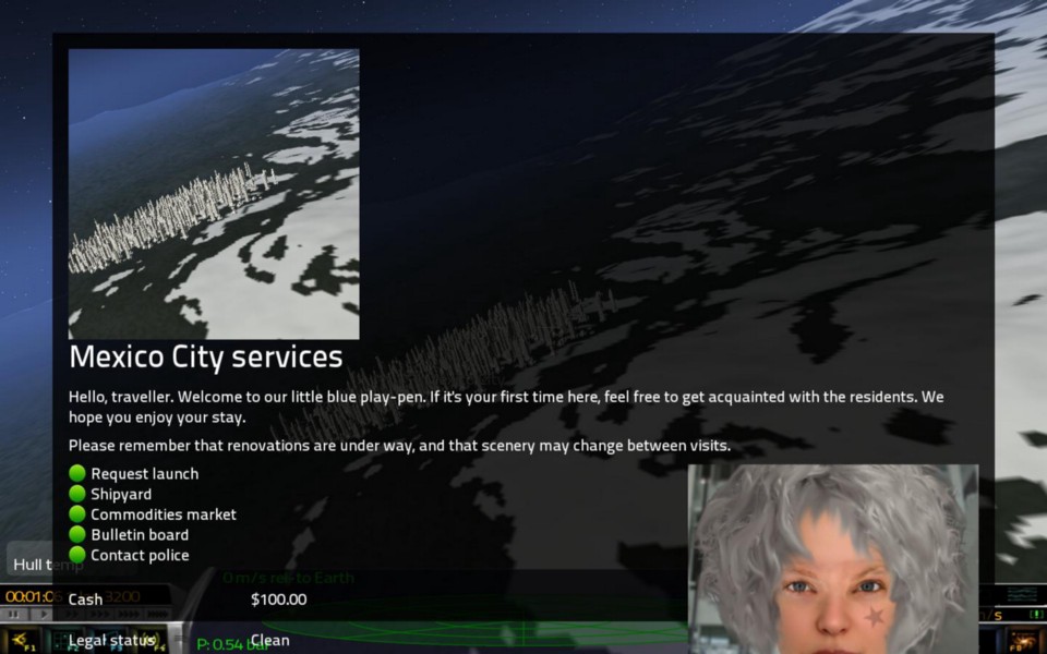
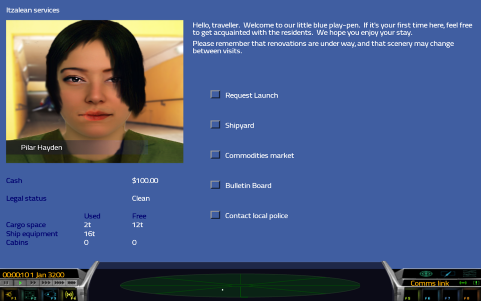
The first UI written for Pioneer was already in place when I joined the project in early 2011. At the time of writing (October 2013) its still driving much of the game UI, though we are slowly replacing it.

Obviously it worked well enough for what it was, but it has some fairly serious limitations which only became really apparent once we started trying to build more sophisticated interfaces with it.
- The whole UI is drawn on a virtual 800x600 screen, which then gets stretched to the window size. This makes things look really odd on hi-res and non-4:3 screens.
- UI elements like buttons are drawn from OpenGL primitives, making it very difficult to restyle the interface.
- The available layouts are not very powerful, and given that it can be assumed that the screen is always 800x600, most clients tend to resort to fixed-positioning.
- Like so much of Pioneer’s early code, the UI code uses lots of globals state and is deeply entangled with the game engine. It also calls into OpenGL directly instead of going through the renderer (which was added much later).
- It’s very difficult to control the UI effectively from scripts, mostly because of its use of globals which make it hard to manage object lifetimes.
In mid-2011 I started to understand that this situation wasn’t going to work for us long-term. By this time we’d established that we wanted Pioneer to be highly customisable without needing to modify and recompile the engine. For the UI, this meant we needed something that can be driven by scripts and styled from data files.
Another significant need came from the recognition that we wanted Pioneer would run on screens of all different sizes. So our entire UI system needed to be written in such a way that it could always be made to look good without ever explicitly positioning a UI element.
While I hadn’t seen a system with these features, I also wasn’t very familiar with what was available. I was eager to use something off-the-shelf if at all possible. We’re a small team and if we can outsource a major component like a UI engine then we get more time to do other things. And it didn’t really seem like our requirements were that weird — lots of games have scripts, and lots of games run on different-sized screens. How hard can it be?
I studied about lots of different UI engines but only actually tried a few. I’m remembering events from two years ago here, so if they don’t match current reality, assume its because I forgot something!
Guichan
Guichan was the first UI system I tried integrating. It wasn’t hard to hook up, but was discarded pretty quickly when I noticed that it uses pretty much the same virtual screen concept as our existing UI. But to its credit, it was the one that made me realise being able to operate at the native screen size was important.
GWEN
GWEN is a really nice UI system, and it wasn’t hard to get it up and running on Pioneer’s main loop. The main thing that hurt it for us was the fact that it really seems more suited to a traditional desktop-style application. It very much wanted to create windows to do things, and didn’t seem to provide many options for layout outside of that. I also recall it wasn’t easy to create custom widgets, of which we need many.
I did however take away two important concepts from GWEN. One was the use of a single texture for widgets, sliced up in a way that makes resizeable widgets possible without stretching the texture. The other was the way relative positions and gravity were used to layout widgets. I didn’t use that directly, but kept it in mind.
Berkelium
Berkelium is essentially a headless version of Chromium that you push HTML and CSS into and get the rendered UI out of. Awesomium is a popular variant along the same lines. I didn’t actually try this one myself, a fellow developer did, and he got it working but abandoned it. It might have been my fault that he dropped it, not sure. I remember that I never thought it was a good idea though, and I still don’t. In my opinion an entire web engine is far to powerful for what we’re doing. Remember that as well as a game, we’re building an engine that is designed to be customised. I think that’s too much power and responsibility to give to users, and too hard to protect the engine from. But I’m glad he tried it all the same.
libRocket
Which brings us to libRocket. Its effectively a minimal HTML and CSS implementation for game UIs, and its fantastic. I integrated it easily and spent a long time working on it. I was convinced that it would be the right fit for us — it was easy to expose, constrained enough that it wouldn’t be hard to control, and had some really nice concepts like decorators and custom elements to make it easy to integrate.

We got a long way with this one (and if you’re really interested, issue #594 has a load of screenshots and discussion). The place it finally fell down is actually a fairly common problem with CSS-based layouts — its basically impossible to anchor an element to the bottom of the window and have everything else flow around it. The most common solution is to use Javascript to compute the height lost to the anchored element and limit the rest accordingly, or more recently, flexboxes. libRocket implemented neither. I tried to implement flexboxes but libRocket has a single layout engine and makes some big assumptions about what it will do, making that largely impossible.
So after over two months of development, I made the hard choice to abandon libRocket. And after six months of experiments, we were back to square one.
By now it was November 2011, and I was done with UI hacking for a while. I went off for a while and didn’t think much about it. In the new year I started some new refactoring experiments on the existing UI, which became the core of a brand new UI system built for our purposes. It took another ten months before the new UI was fleshed out enough to be merged into the project properly. We’ve now had it for a year and although its still not available everywhere, its being used for more and more stuff. Its had some significant changes in this time but the fundamentals of its design seem to be holding. I can only assume that the experience with so many other UI systems helped make that happen.

So that’s enough of the history. Next time we’ll start looking at the engine itself and see how it works.