Multi-line text layout
The Pioneer UI has long had a problem laying out multi-line text. The problem is that each widget is required to report its ideal size, but that’s always seemed a difficult thing for an arbitrary body of text, which has many valid layouts.
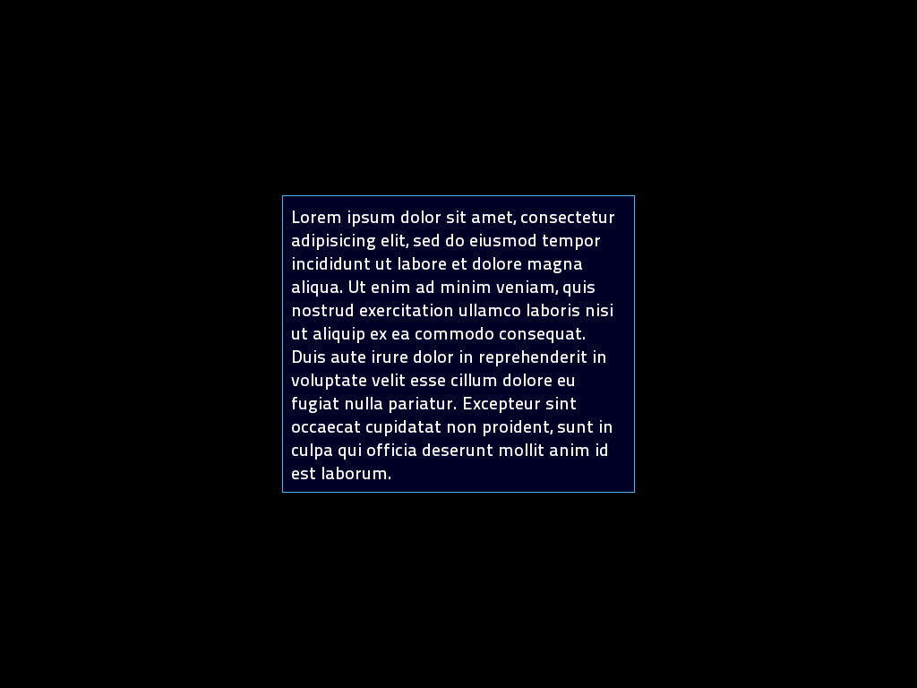
Since it was first written its always reported an “I don’t care” sizing, meaning the container should choose. Some containers (like Align, which collapses around its content and then positions) rely on its content to report a sane size. Leading to a very useful concept like centering a multi-line text body being impossible, because Align would collapse its contents to 0. You ended up having to pull some fixed-size tricks with a Grid.
The solution has always been clear - provide an ideal size. The problem was that it always seemed impossible. How can I possibly know what the ideal size is when I don’t know what the surrounding layout looks like and don’t know what the text is about. So I just ignored it for as long as I could. But recently we’ve gained the ability to have proper modal dialogs, and they really need to be sized according to their content.
This morning I had an epiphany. We do know one thing about the text we’re laying out, and its probably the most important thing - it has to be readable! So a quick search later finds this:
http://baymard.com/blog/line-length-readability
Which suggests anywhere between 50 and 75 characters is ideal for reading, since the brain slows down as you approach the end of the line. So I added a single line of code to set the “ideal” size of the text area to 75*space width, with a “I don’t care” height. And suddenly, we get a nice collapsed alignment on text. Too easy!